Book vending machine interaction
Encouraging reading habits
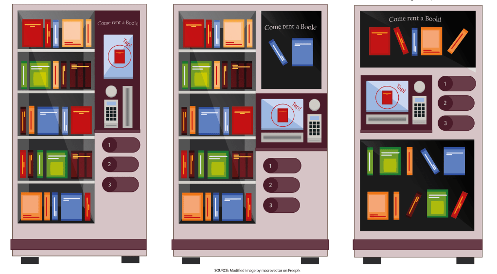
Through the design exploration of a book vending machine system for London commuters, this project aimed to analyse how to assure user engagement to promote reading habits. The UX team examined the vending machine user journey from initial engagement to transaction completion. From ideation to usability testing low and high-fidelity prototypes, leading to conclusions on how to approach the design concept of this product.
My role
User experience researcher
Team members
Aishwarya Ilamurugu Porchelvan, Jingyi Wen, Marzieh Jamalifard, Sirui Chen, Tong Wu
Responsibilities
- Planned and organised research team meetings
- Conducted and analysed ethnographic observation sessions
- Led ideation sketching sessions
- Review low and high-fidelity prototype before test
- Defined protocol and questionnaire for the usability testing sessions
- Determined the user flow map for the vending machine interaction
- Led affinity diagram sessions to analyse test data results
Design process
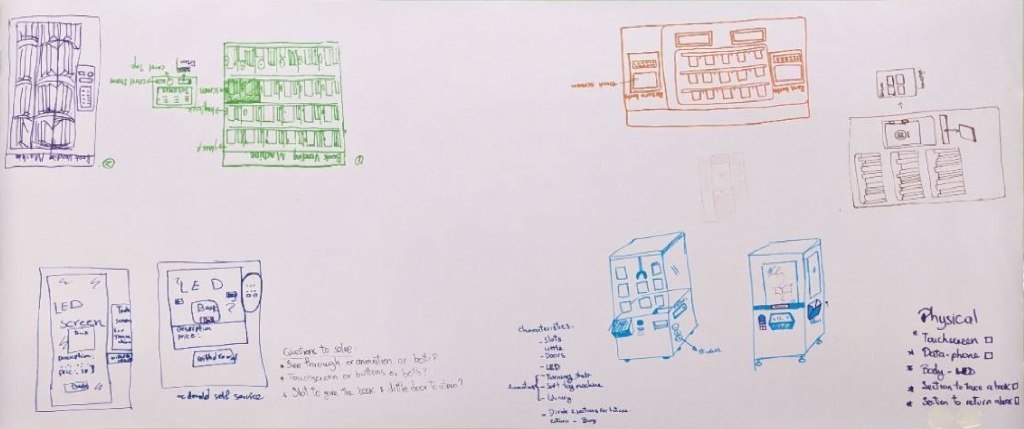
The prototyping and testing stage took the focus on this project. Even though, the research team used a varied group of methods during the initial stage. These methods helped them understand user’s motivations and preferences when reading on public transport. This was followed by a thorough ideation stage where both physical and digital interfaces were conceived.
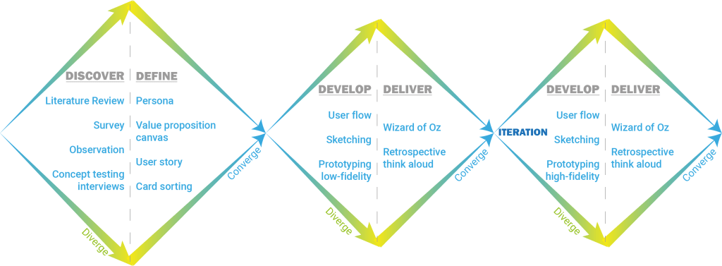
Project Milestones
Discover: Surveys
Two surveys were conducted to understand users’ reading habits, preferred book-finding methods, and expectations for the device’s physical and digital interface. It was found that:
- Main factors stopping reading habits during user’s commute are prioritising commute comfort and book accessibility.
- A book rental service and personalised book recommendations are features that can encourage reading when using a book vending machine.
- Users prefer to filter their search by Best sellers (55.6%), Feeling related (22.2%), and Words in description (22.2%)
- Users would prefer a different interaction to deliver the books out of the vending machine, rather than dropping the products as traditional vending machines do.
- Intuitive navigation is relevant for users when interacting with vending machines not just to efficiently find what they are looking for but to encourage reading.
- Search criteria: Genre > Subject > recommendations
- Users prefer to interact with touch screens and digital displays rather than button interfaces for book vending machines.
Discover: Ethnographic Observations
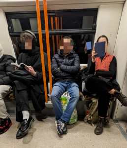
Two sessions took place to analyse users’ behaviour when interacting with reading services at train stations. The first session focused on the Free Reading Library at Lewisham station, where 15 individuals approached the shelves, with 4 selecting a book to read. Among the materials of interest were magazines, fiction books, and children’s literature.
In the second session conducted on trains during a week of commute, all observed individuals who were reading were adults over 20 years old. Notably, 42% were over 60 years old reading newspapers, followed by adults aged 25 to 30, who represented 16% of the population reading mainly fiction and semi-biographical genres. About formats, 48% were reading paper books, while only 13% utilized portable reading devices.
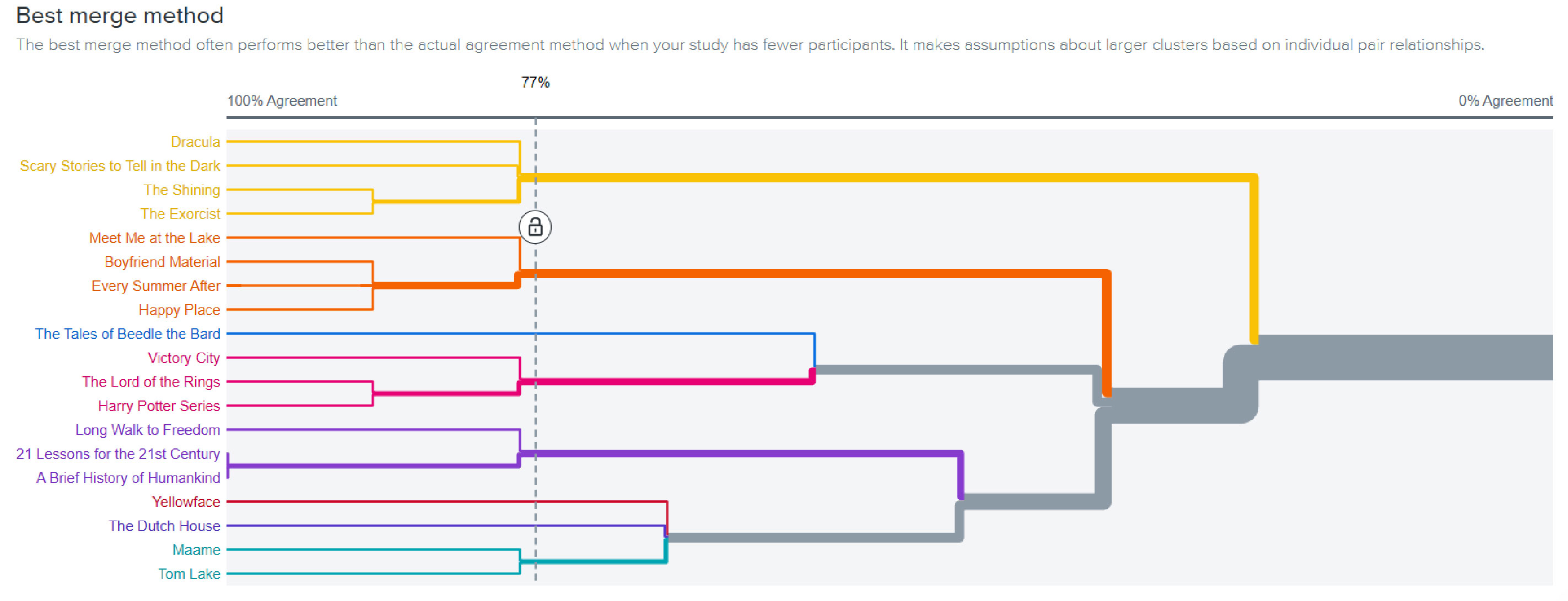
Define: Card sorting
Exploring how to better organise the books selection in the vending machine’s interface system to define its information architecture. Participants were given an Optimal Workshop link and tasked with grouping and labeling 25 book information cards. The dendrogram from the Best Merge Method (BMM) algorithm illustrates the preferred sorting categories for participants. These were in order: Genre, Ratings, and Language.
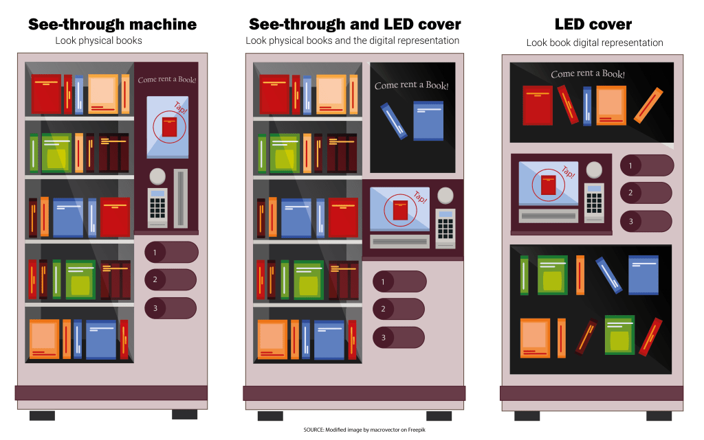
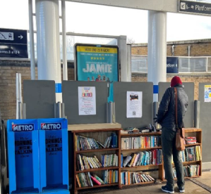
Current book vending machines at train stations are not attractive. They only allow commuters to purchase a book without any additional information. Our solution should deliver additional interactions rather than just purchasing to encourage people to read. This way commuters can make the most out of their time on the train.
User problem
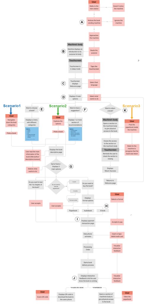
Develop: Interaction user flow
Developed to lay out the process key users would go through when interacting with the machine in four scenarios:
- Looking to buy or rent a specific book
- Looking for recommendations on what to read
- Returning a paper book that the user rented
It is divided into sections from A-J:
- Machine introduction
- Language interface choice
- Services selection
- Book selection
- Get recommendation
- Service Options
- Selection of Book Type
- Payment Options
- Confirmation of Transaction
- Returning a Book.
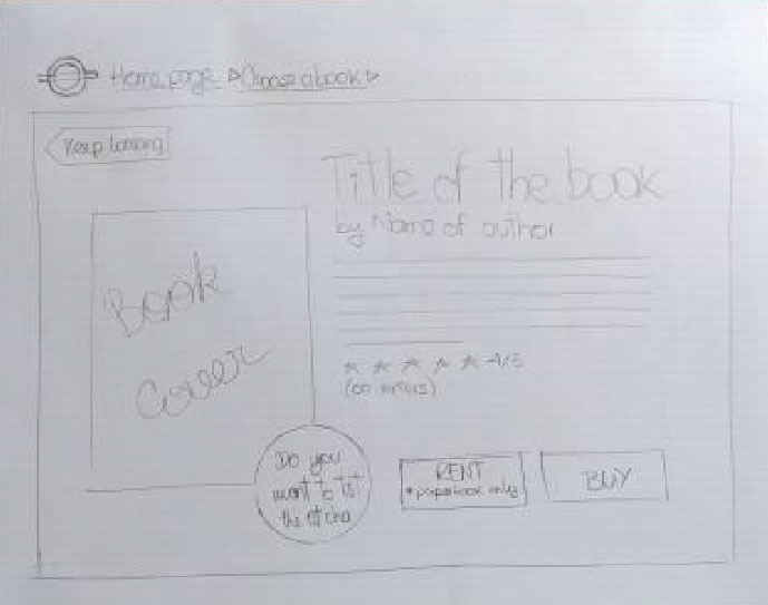
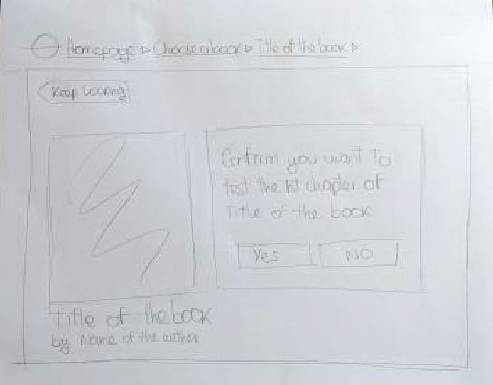
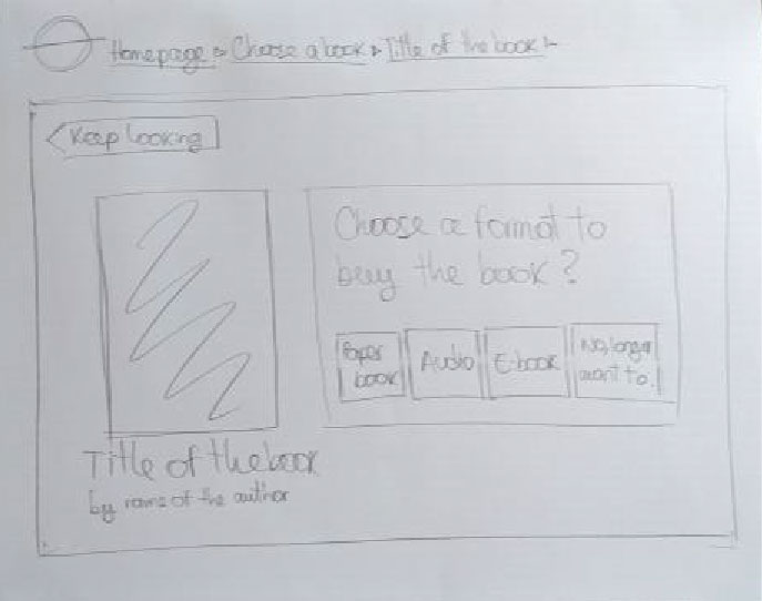
Low-fi prototype
This provides an opportunity of quick and cost-effective testing with design and user interface flow. This method also allows initial user feedback and product modification to better serve the target audience (Nielsen Norman Group 2024).
Usability test
Structured in 4 tasks to analyse the user interactions on the main scenarios the machine could be used: tovchoose a book in 2 different formats, to check recommendations and when returning a book.
The researchers followed a pre-established protocol while the participants were performing the tasks and answering the follow-up questions. The metrics are primarily focused on user satisfaction and ease of use, measured through the rating scales in the form.
Usability test results
Welcome & Home Page
Most users navigated smoothly, but when they were asked to buy an specific audiobook 4 out of 6 clicked on Discover a recommendation instead of Choose a book, likely due to the central placement of the recommendation button.
Choose a Book
- Users praised the smooth interface and well-organized filters.
- The search bar saw little use but will be retained for specific queries.
Recommendations
- The main recommendation page felt overloaded to most users, and no one interacted with Words in description section, so this feature will be removed to improve visual clarity.
- Best Sellers organization by genre was well-received, while Feelings-related filters caused confusion.
- Prototype issues: Some items lacked clear affordances (e.g., book images were not clickable).
Book Description Page
- The design was intuitive, but two users misunderstood Read the 1st chapter? Assuming they had to read it on-site. The button will be changed to Download 1st Chapter (Free) for clarity.
- More rental duration options will be added, up to a 4-month maximum.
Payment Process
No usability issues; a Next button may be unnecessary based on other payment systems.
Return Process
- While generally straightforward, some users felt there were too many steps.
- Visual feedback will be improved to guide users on where to insert books in the vending machine.
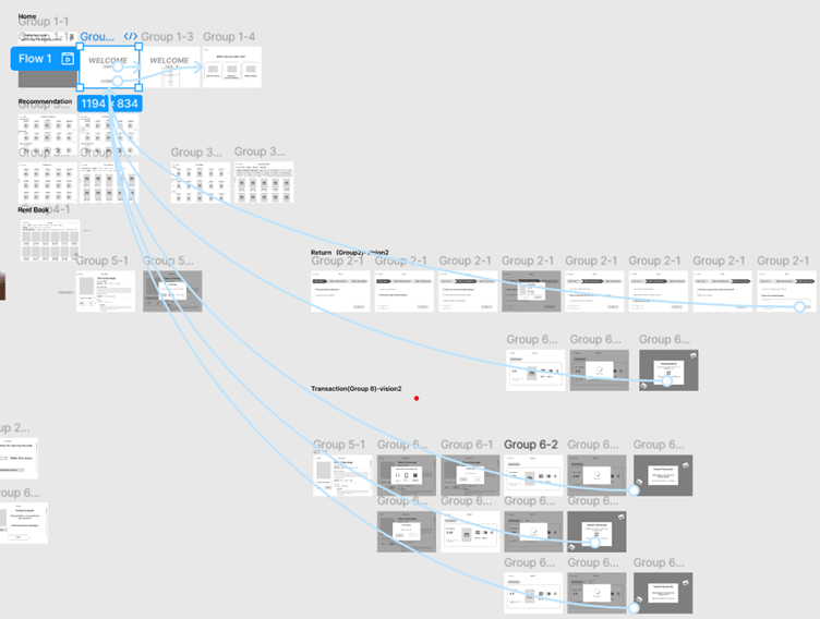
High-fidelity prototype
Based on the usability test results a second iteration on the interface functionalities design was prototyped and tested following the same protocol. The high-fidelity prototype was tested with both returning and new participants to evaluate improvements in usability, interface, and feature functionality. Task completion times were recorded as a key metric.
Usability test results
Returning Users (previously tested low-fidelity)
- Average time to complete key tasks (choosing, transaction, recommendation, and renting): 43.3 seconds.
- Found significant improvements, especially in the minimalistic recommendation section.
- Rated usability 4-5 out of 5.
- Raised concerns about longer rental periods increasing uncertainty about timely returns.
New Users
- Found interaction flow clear and appreciated the “Test First Chapter” feature.
- Average task completion time: 34.2 seconds.
- Rated usability 5 out of 5.
- Suggested enhancing hierarchy by making the search bar and top 3 best-selling books more prominent.
- Recommended automating transaction steps (e.g., removing the need to click Next when swiping a bank card or scanning a barcode).
