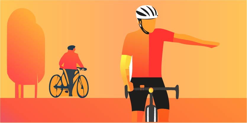
Brighter Bikes indicators
Enhancing the experience of Bicycle Turn Signals (BTS)
Master’s dissertation in collaboration with Brighter Bikes
Brighter Bikes aims to improve the user experience of their 2023 BTS model ahead of its launch in 2024. Through a structured design process, I identified actionable insights which enhanced the usability on the 2023 model. I also provided five design guidelines to help developers create more intuitive and user-friendly products in future releases.
My role
Lead UX researcher
Responsibilities
- Led, scoped and planned a research project
- Identify usability challenges
- Test possible solutions with a physical prototype
- Compile design guidelines
Supervisors
- Sharathkumar S. from Goldsmiths University of London
- Steven Ransom from Brighter Bikes
Background
For my master’s dissertation in User Experience Engineering, I was determined to collaborate with a British cycling products company. I reached out Brighter Bikes who had 100 of their BTS ready to launch. Attracted by the project, they wanted to carry out a usability evaluation on that 2023 model to enhance its user experience. I proposed to take it further and analyse features for future BTS versions, compiling the learnings of the process.
Constraints
- No access to real users of the specific BTS model, as it hadn’t been launched yet.
- Time and budget restrictions to test more features on a functional physical prototype.
- Participants proximity to UX lab facilities limited the use of eye tracking technology.
My journey
This formative research employs a mixed-methods methodology, gathering both quantitative and qualitative data. Due to the nature of the project, Research through Design (RtD) approach was taken, to produce knowledge by understanding the current state of Brighter Bikes indicators and making suggestions that can improve it. According to this, the double diamond design process was followed to organise the methods from this study vis-à-vis the research questions.
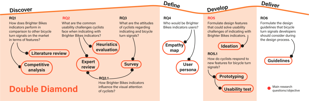
Project Milestones
RQ2: Identified usability challenges cyclists face with Brighter Bikes indicators.
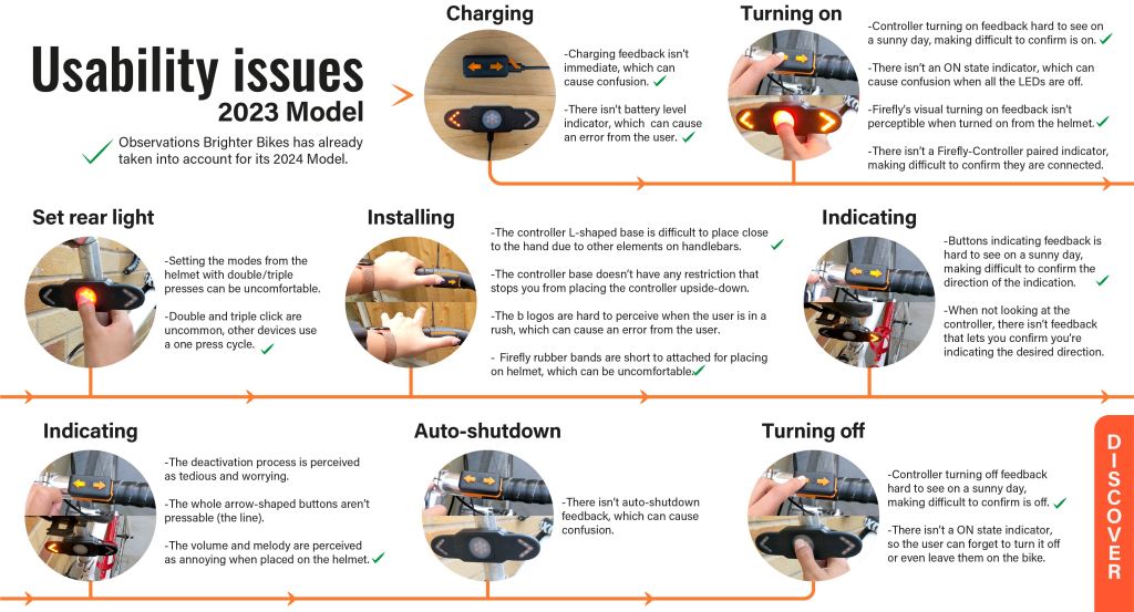
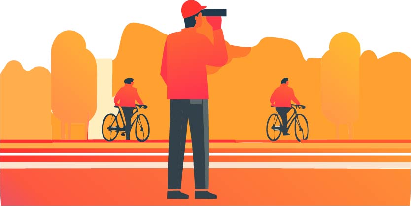
There were not real users of this specific BTS model. So, in order to identify its usability issues, I decided to carry out a Heuristic Evaluation and an Expert Review. These methods were both based on the current user flow.
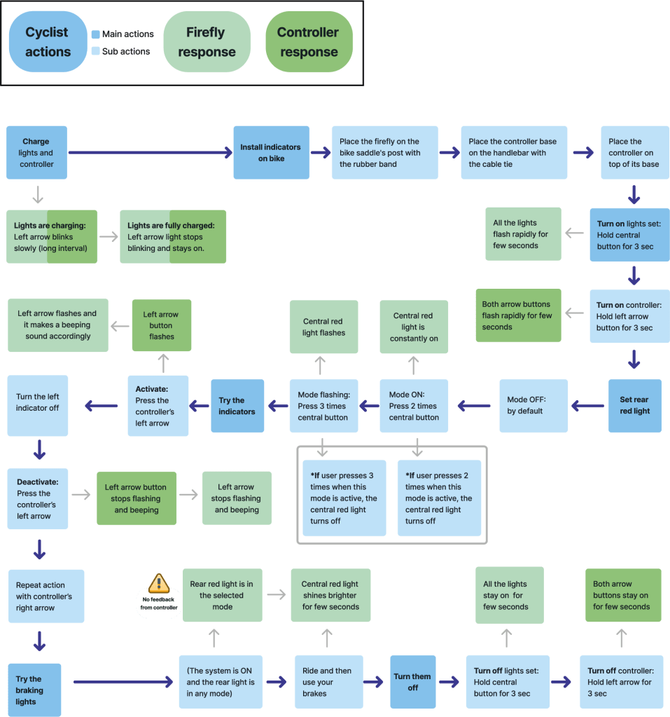
Heuristic evaluation
It was structured on 4 adopted design principles which pointed out 18 potential issues on the 2023 model. Most observations focused on the visibility of the system status (51%), where there were issues on the effectiveness of the visual feedback.
Expert Review
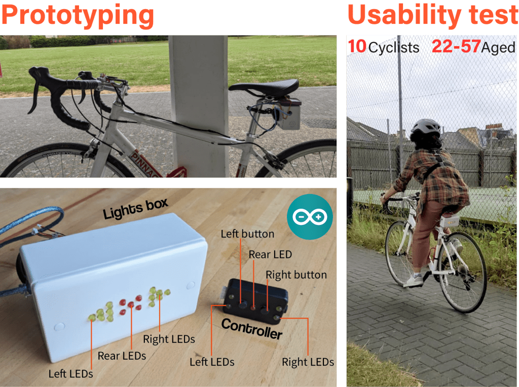
It was complemented with a usability test, where a UX expert and experienced cyclist evaluated the indicators after having cycled with them for a week. The insights were collected on a follow-up interview, as well as on a daily after cycling questionnaire. Themes focused on the four previously adopted heuristics principles and three UX aspects: Comfort, Visual attention, and Mental Workload.
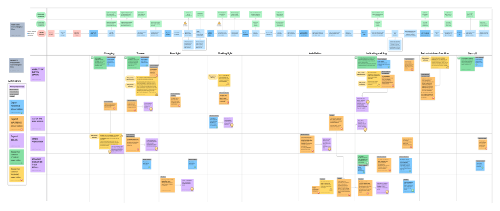
Heuristic evaluation and Expert Review on FigJam. The analysis clustered notes that marked similar issues by heuristic principle or by stage of the user flow, following a
deductive thematic analysis approach.
RQ3: Cyclists’ attitudes regarding indicating and bicycle turn signals.
Getting to know the opinion and expectations of potential users on BTS functionalities was pivotal. Reason why a survey took place as an online questionnaire. The final sample were 291 cyclists, from which 8% had experience using BTS. Qualitative data was manually coded into concepts and grouped into categories based on similar topics and examined in an affinity diagram.
Opinions on indicating
Cyclists decide where and when to indicate based on their views on the need to indicate and safety concerns. Additionally, they won’t indicate if it generates the risk of an accident. The most common communication cue used to indicate is hand signals. Cyclists consider indicating highly important and say they do it frequently, but another study observed the opposite.
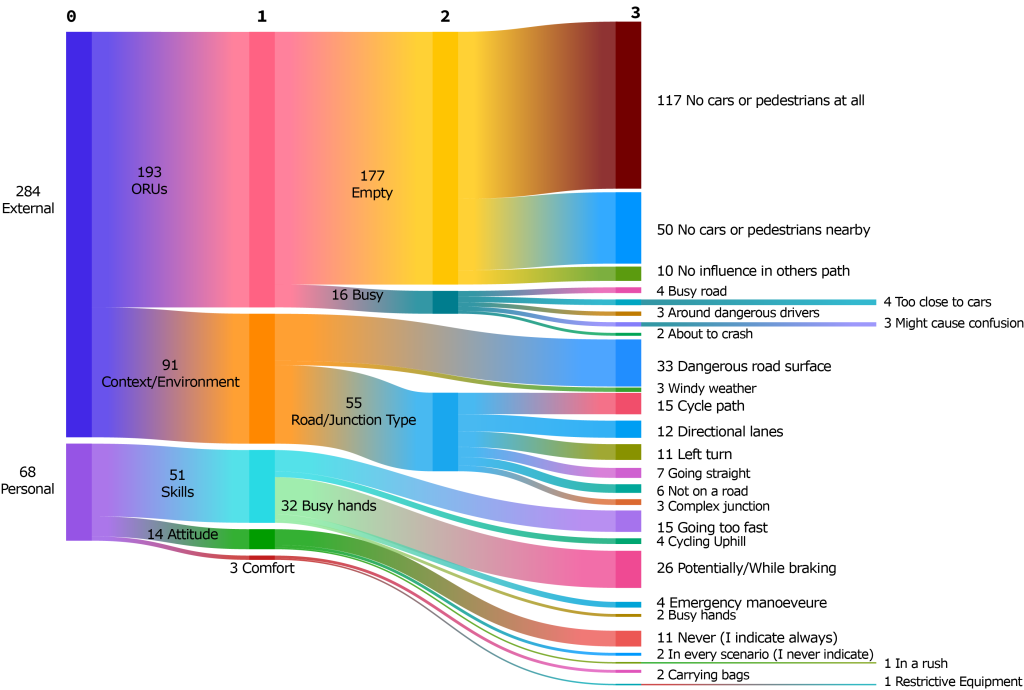
Opinions on BTS
Cyclists who have not used BTS said the main reasons are that hand signals are sufficient. They are concerned that drivers will not understand BTS signals and about the price these devices may have.
Cyclists who have used BTS said they would improve BTS on the market by including frontal indicators and spacing out their arrows. They would love that BTS auto-deactivate after turning and to not have to use a BTS controllers. They assure BTS don’t distract cyclists’ visual attention, as they learn to use them without looking.
Commuting cyclists need a way to reinforce their communication on the road because they don’t trust drivers to pay attention to their indications.
Based on survey insights
RO5: Formulate design features that solve the identified usability challenges.
Brighter Bikes executed 8 modifications to the code of the 2023 model. They based these modifications on 10 out of 20 observations from the Heuristics evaluation and Expert review. The ideation and testing stages targeted feedback issues that would require hardware modifications. Developers can consider these in the future.
RQ5.1: Usability testing new features.
Two features were prioritised for testing using a physical prototype:
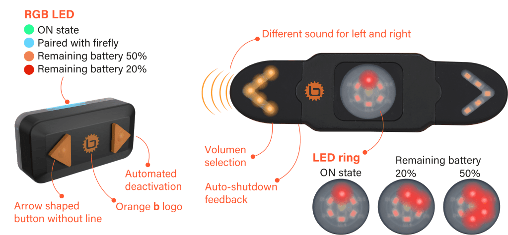
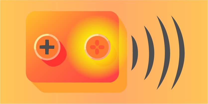
- The differential sound feedback provides cues for left and right. This helps reinforce the direction of the indication for the cyclist. They can confirm which direction the lights are marking.
- The automated deactivation makes the interaction simpler and less tedious, so cyclists don’t have to click again when they want to deactive an indication.
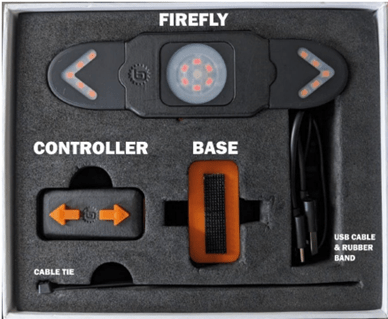
A physical prototype was developed to test both features in a naturalistic environment with potential users.
Differential sound feedback
The prototype had 2 different beeping sounds. For left, high frequencies and for right, low frequencies. It was concluded that the use of two different sounds as turn signal feedback is sufficient to convey the direction of an indicator, after few minutes once the user is used to it.
Automated deactivation
I couldn’t automate the deactivation due to coding limitations, but the prototype automates the entire indication process. This allowed users to experience at least the automated deactivation. As a result, participants like not having to think about turning off their indicators. They see value on integrating this feature to a BTS with controller, so they can also decide when to activate the indication.
BTS Design Guidelines
Bicycle turn signals as a communication reinforcement
There is always more to learn about cyclists
Consider diverse cycling context
Bicycle turn signals relies on feedback

Bicycle turn signals must be adaptable
