UX research
Email app
Usability test
Interviews
Prototyping
Increasing customer retention through onboarding
A reflective UX redesign for Wildhero, focusing on improving the user onboarding experience to boost long-term engagement and environmental impact.
ROLE
Consultant UX researcher
TIMELINE
8 weeks
TOOLS
Figma, Figjam, Zoom & Meets
Project Summary
Wildhero’s chrome extension aims to help users regenerate the planet through everyday actions. However, high drop-off rates during the first week indicated a significant onboarding problem. This case study details the process of identifying friction points and designing a solution that successfully increased users’ motivation to explore Wildhero’s interface, consequently increasing retention.
- Impact
- Determined the priority of information for the onboarding process
- Designed visual prototype for onboarding approach
- Provided UI improvements to increase “Your Forest” findability
- Increased the user awareness of Wildhero’s purpose and functionality
Problem area
The CEO knew that users who explore “Your Forest” section on their first interaction were more likely to keep the extension.
How might we motivate users to explore Wildhero’s interface during the onboarding process in order to increase retention?
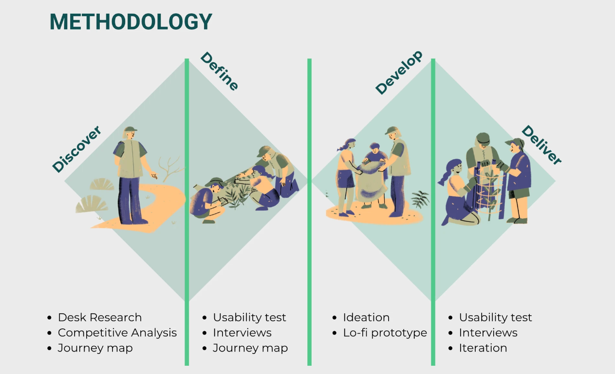
Discover
Mapping the current landscape and identifying pain points.
Current User Journey
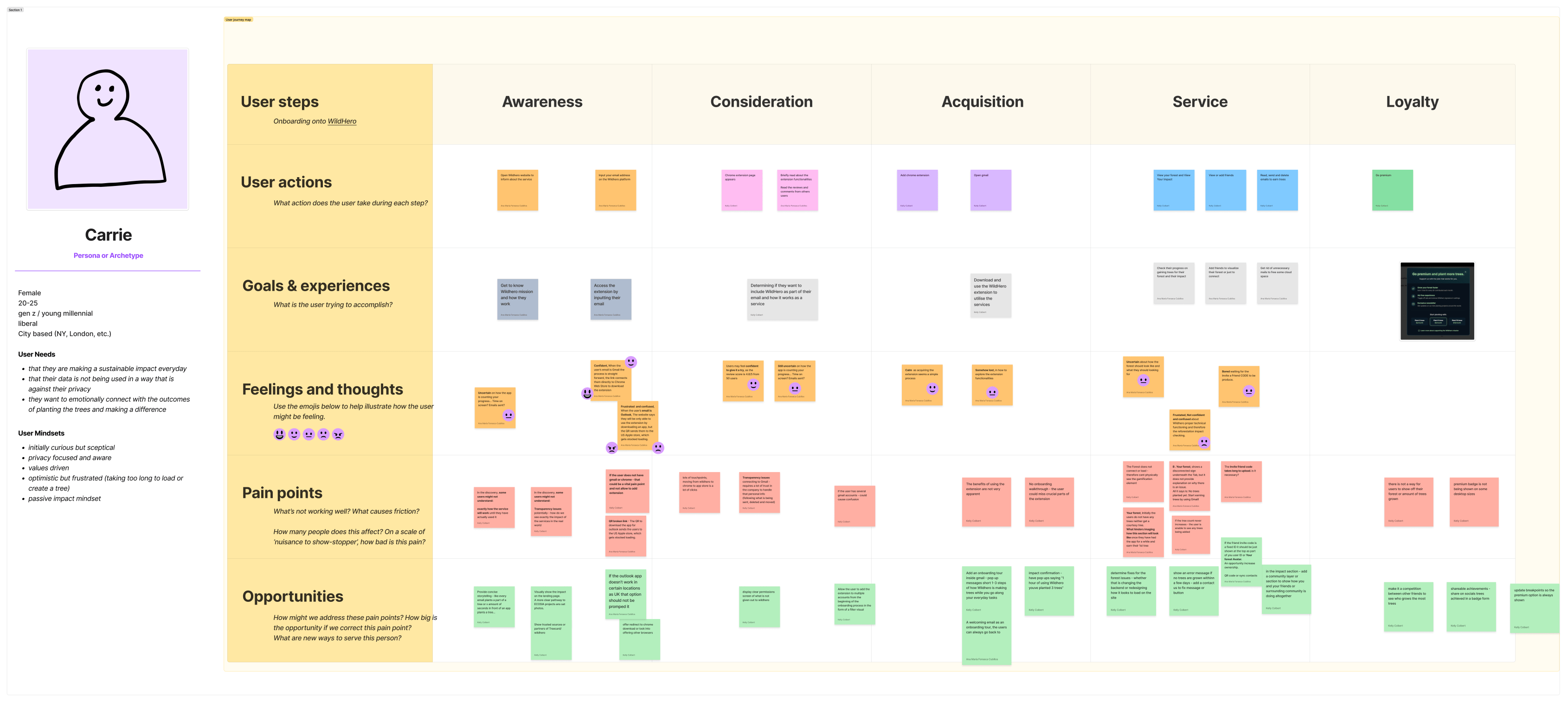
Why this method?
- To help the research team visualise the current onboarding experience.
- To identify key paint points, defining critical areas of focus for the usability test.
Key paint points
Lack of Clear Value Proposition
Difficulty to understand how user interactions are being counted so they translate to real-world impact.
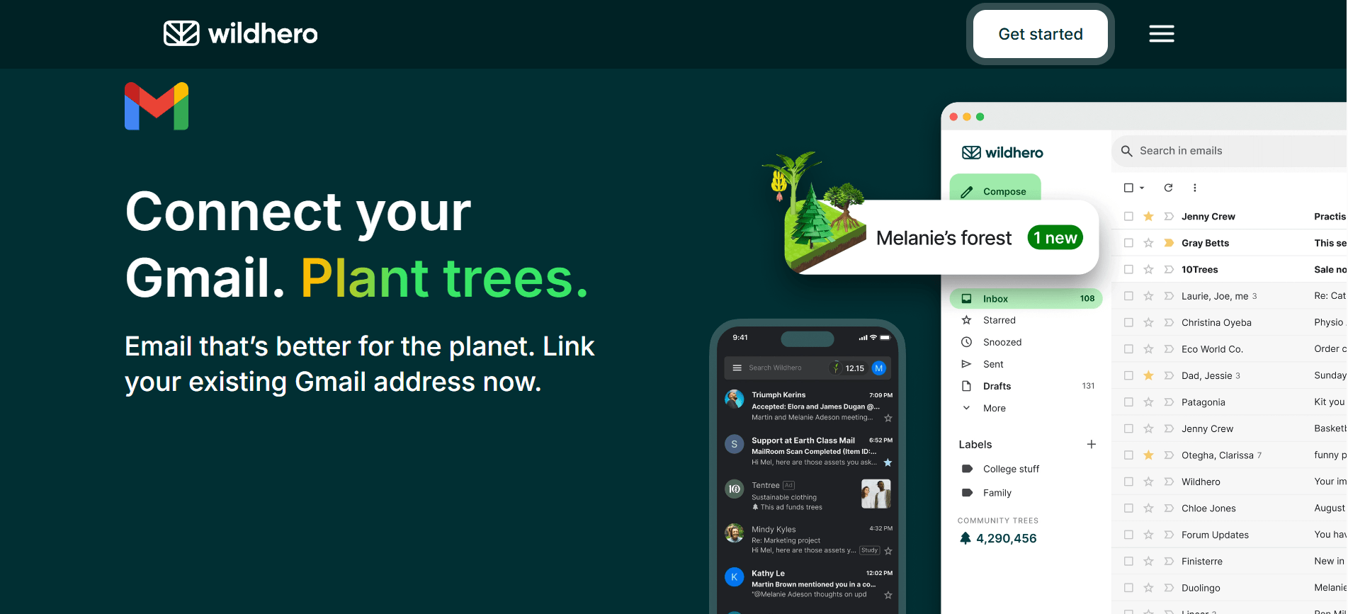
Findability Issues
Once installed the extension, it is not clear where the user should go first or if further action is needed.
Technical and UI issues
Some features, like “Your Forest” which is an essential hook, were not loading for some accounts. Some icons were overlapping on text, harming readability.
Define
Structuring the research and analyzing the data.
Usability Testing
We conducted unmoderated online usability tests and follow-up structured interviews, focused on the initial installation and first-use experience. Why? To uncover hidden usability challenges and expectations during the onboarding process of Wildhero.
Participants: 1 pilot test + 6 usability test
Recruiting strategy
Purposive non-probability sampling method based on Wildhero’s target user description.
Ethics
A consent form including the test goal, data protection policy and right to withdraw was sent to the participants previously to the test for them to read and sign.
| Task Phase | Goal | Metrics | 👩🔬 Researchers actions | 👩💻User actions |
|---|---|---|---|---|
| 0. Set up | *To introduce usability test purpose and protocol for the session. | … | Mention again the test purpose, the ethics and data protection. ⬇️ Share the protocol for the session. | Provide signed consent form. 🔽 Share their screen. |
| 1. Installation | To observe initial expectations and friction | Time to install, Likert scale | ⬇️ Send link for Wildhero website. ⬇️ Record Zoom session… ⬇️ Take notes on Figjam chart… | 🔽 Explores Wildhero website, as if they just got interested and they want to know more. 🔽 Finally, installs the extension. |
| 2. First action | To evaluate findability of core features | Time on task, First Click | ⬇️ | 🔽 Explores the extension’s interface on their email for the 1st time, using talk-out-loud technique. |
| 3. Comprehension | To assess understanding of value proposition | Qualitative feedback | ⬇️ Follow structured interview questions ⬇️ Take notes | 🔽 Responds questions. |
Data Analysis & Key findings
An inductive thematic analysis was carried out to analyse the qualitative data with the intention to find patterns on the user’s pain points when onboarding Wildhero.
What is stopping users from exploring the interface and therefore getting to My Forest section?
User confusion & Transparency
- Users want more clarity on how the extension works and how to earn trees.
- It is not clear what is the impact of viewing ads or closing ads on trees acquisition.
- Transparency on data usage and community impact
UI issues and feedback
- Findability, users struggle finding the “Your Forest button” and “Premium button”.
- Lack of visual feedback generates confusion on which actions are being counted towards earning trees.
- Issues with overlapping illustrations in the forest view.
Platform errors and glitch
- Some users were not able to access “Your Forest”, instead they faced a “Disconnected” error that doesn’t yield a solution, causing frustration.
Develop
Iterating on solutions and building prototypes.
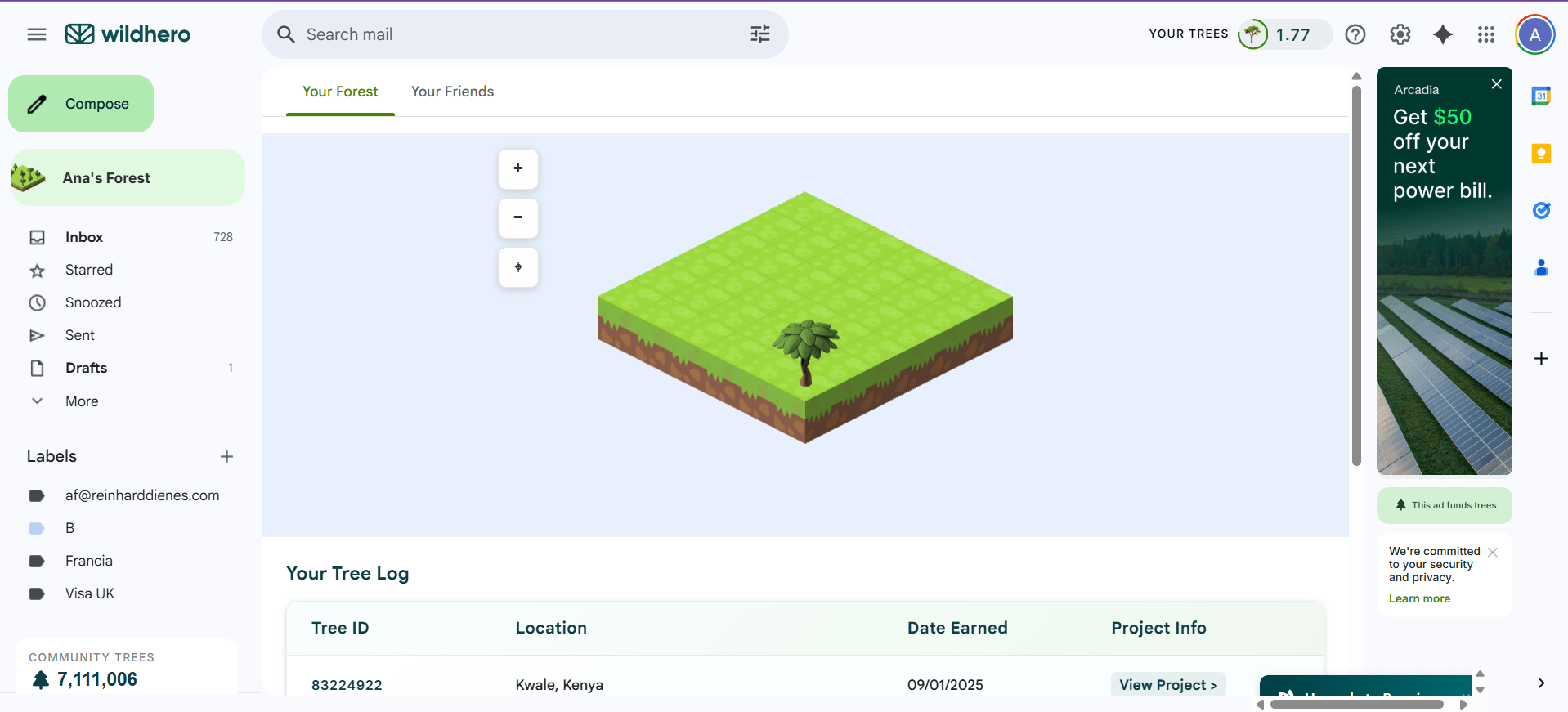
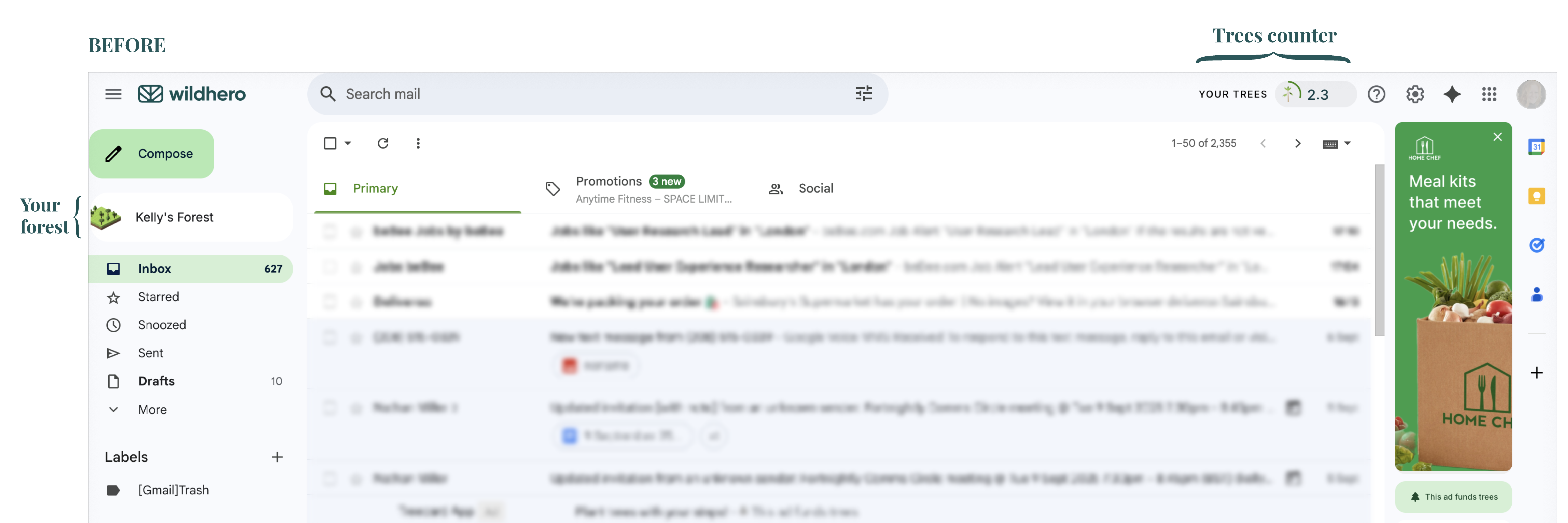
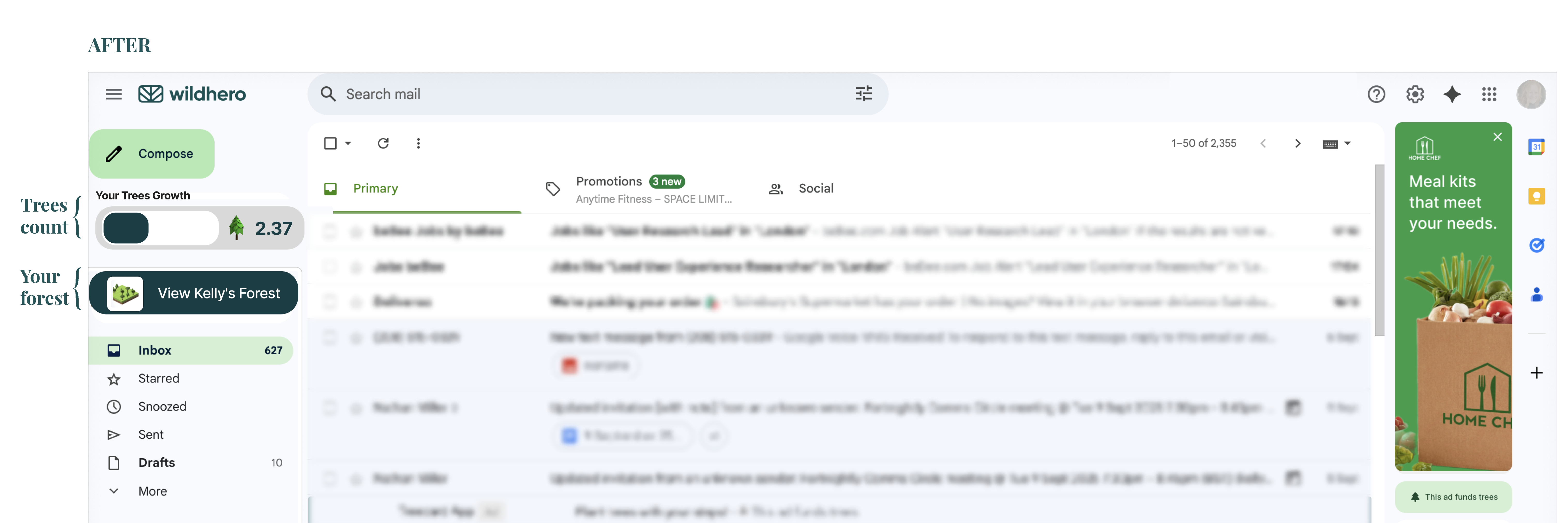
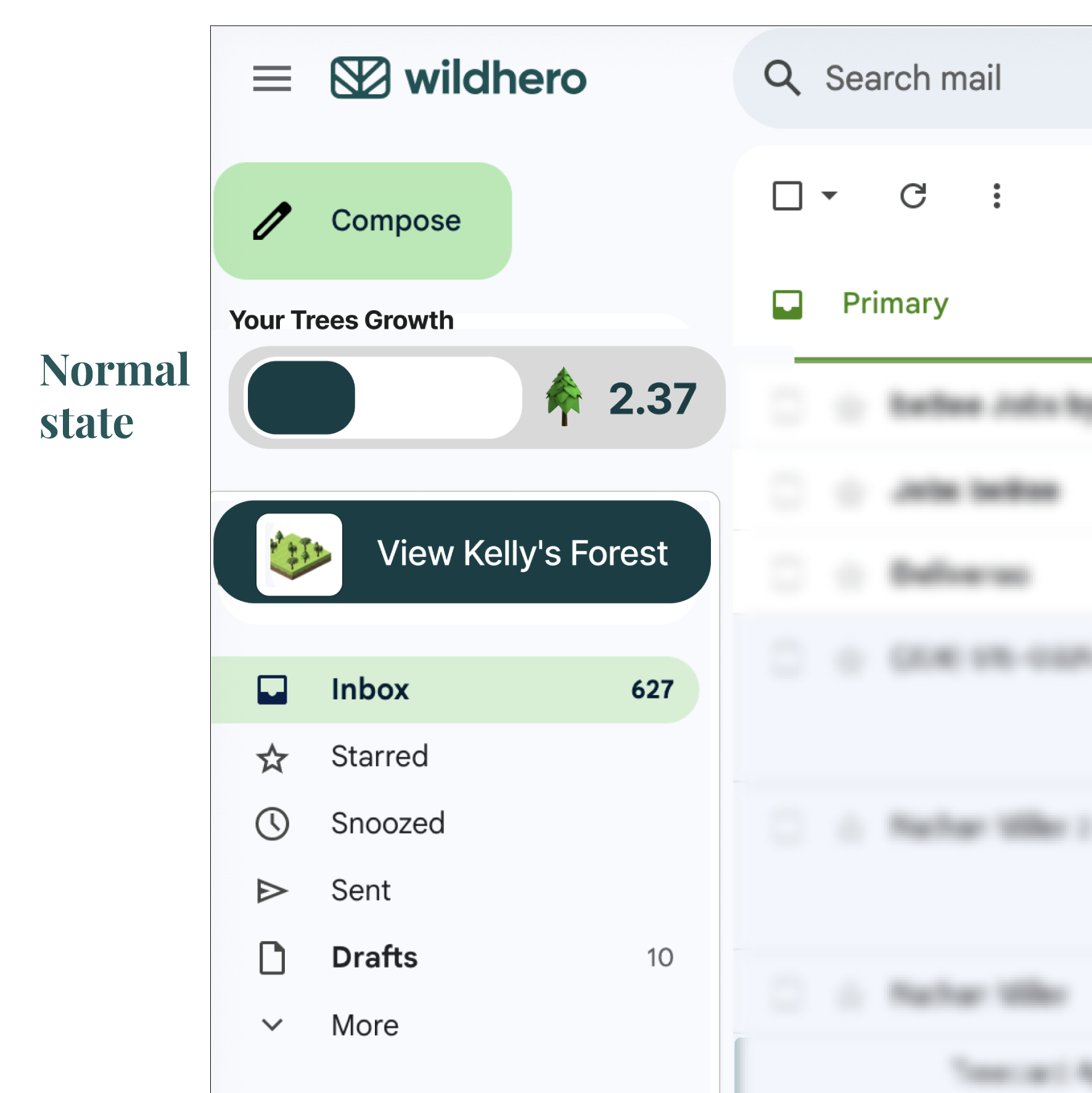
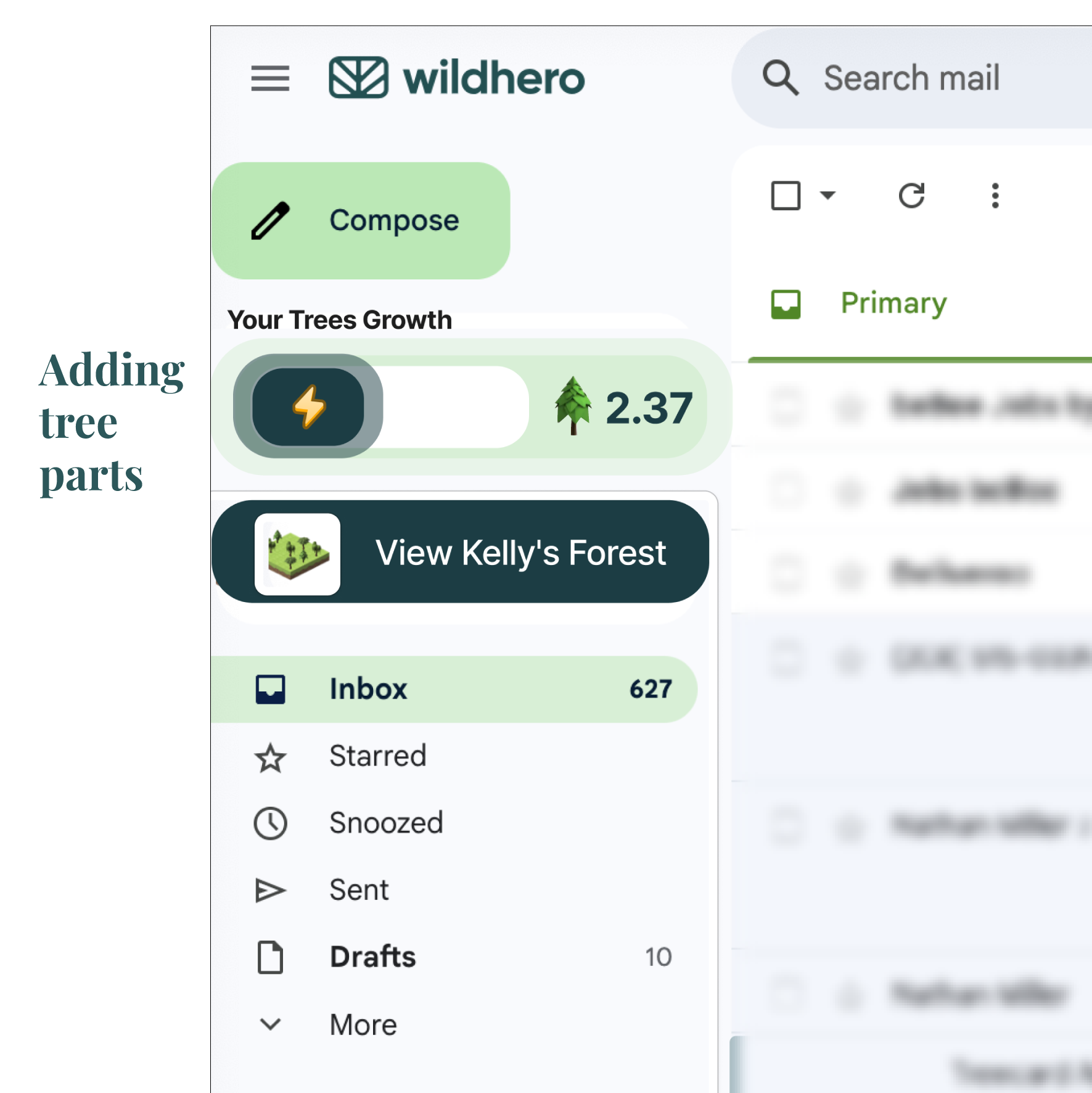
Targeting Findability
We redesigned “Your forest” button and “Your Trees” counter by increasing colour contrast and bringing the items together on the side panel.
Strengthening Feedback
When “Your Trees” counter is going up, the counter will glow up to catch users’ attention.
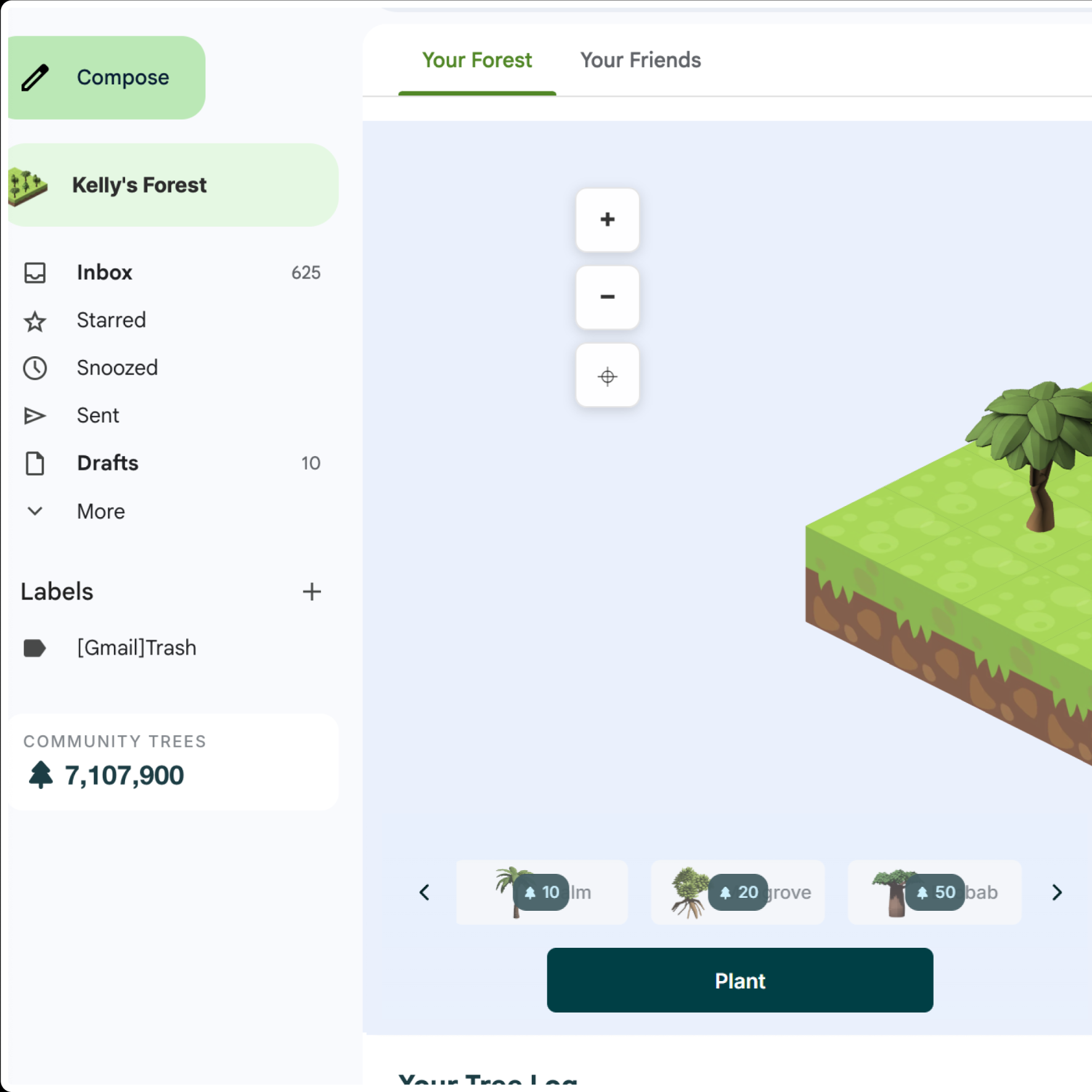
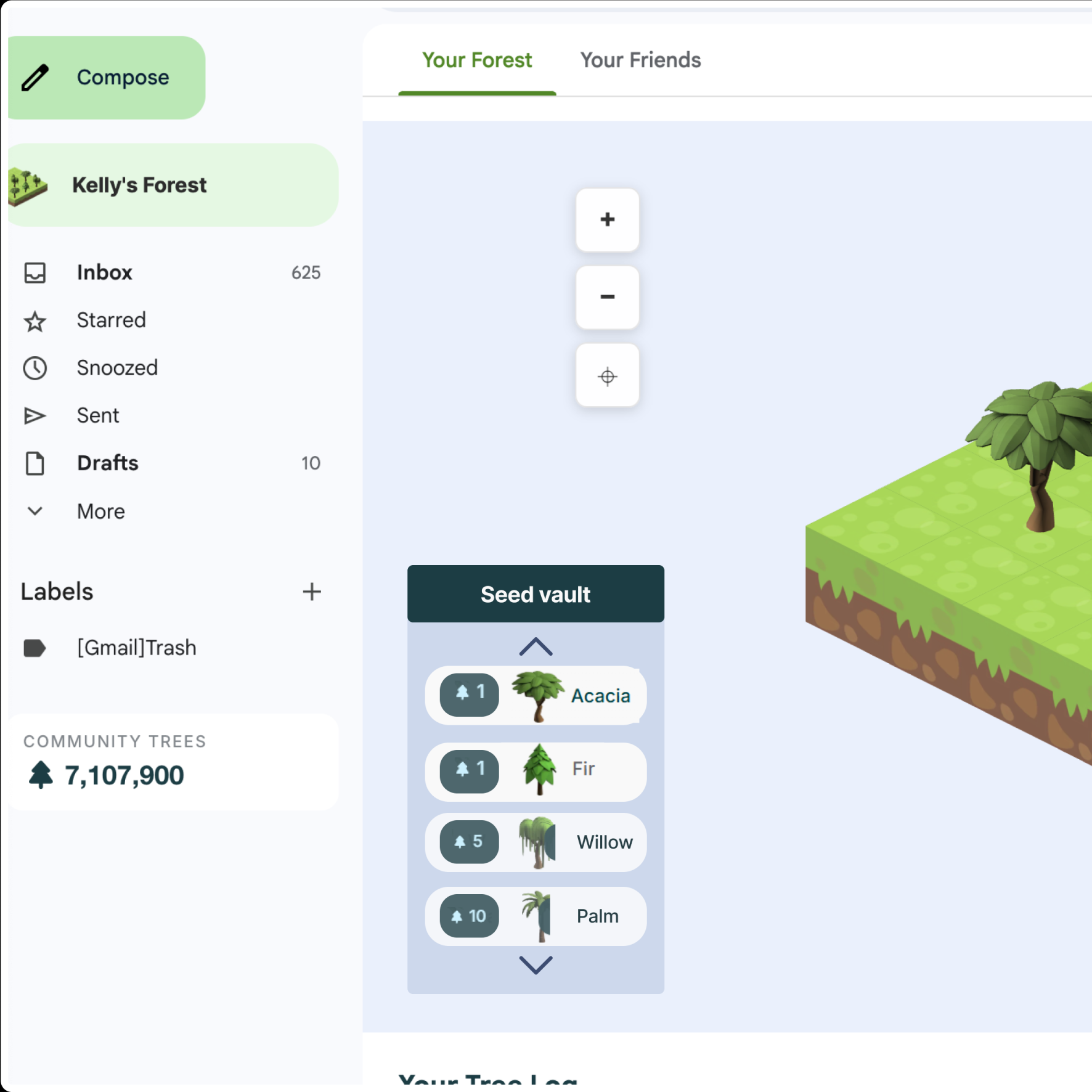
Solving Overlapping
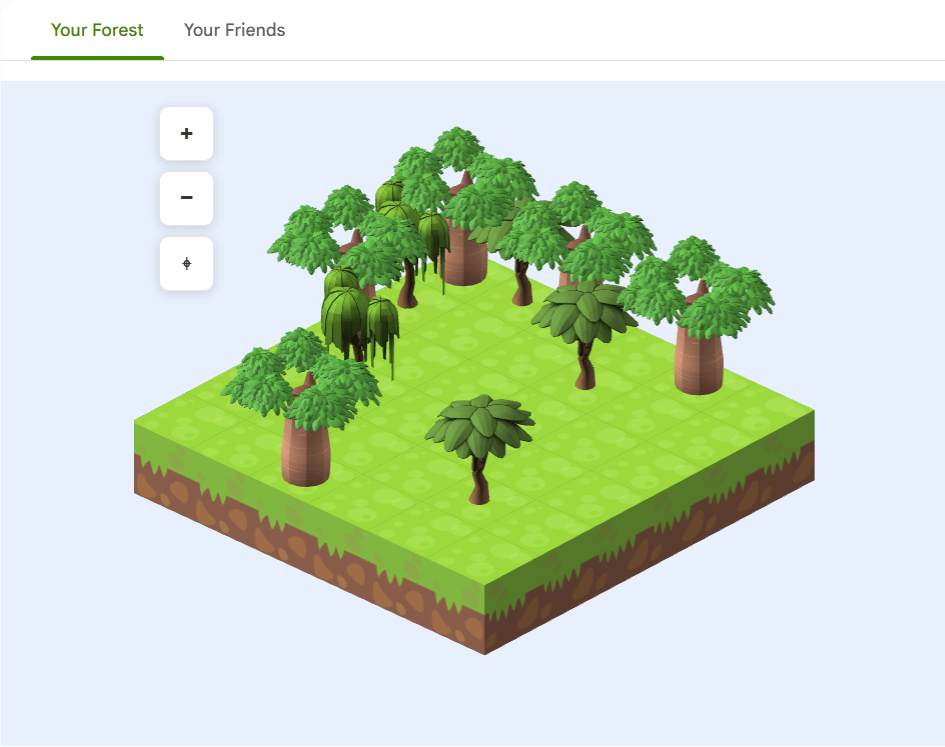
Presenting trees catalogue in a vertical scrolling menu, even before earning your 1st tree.
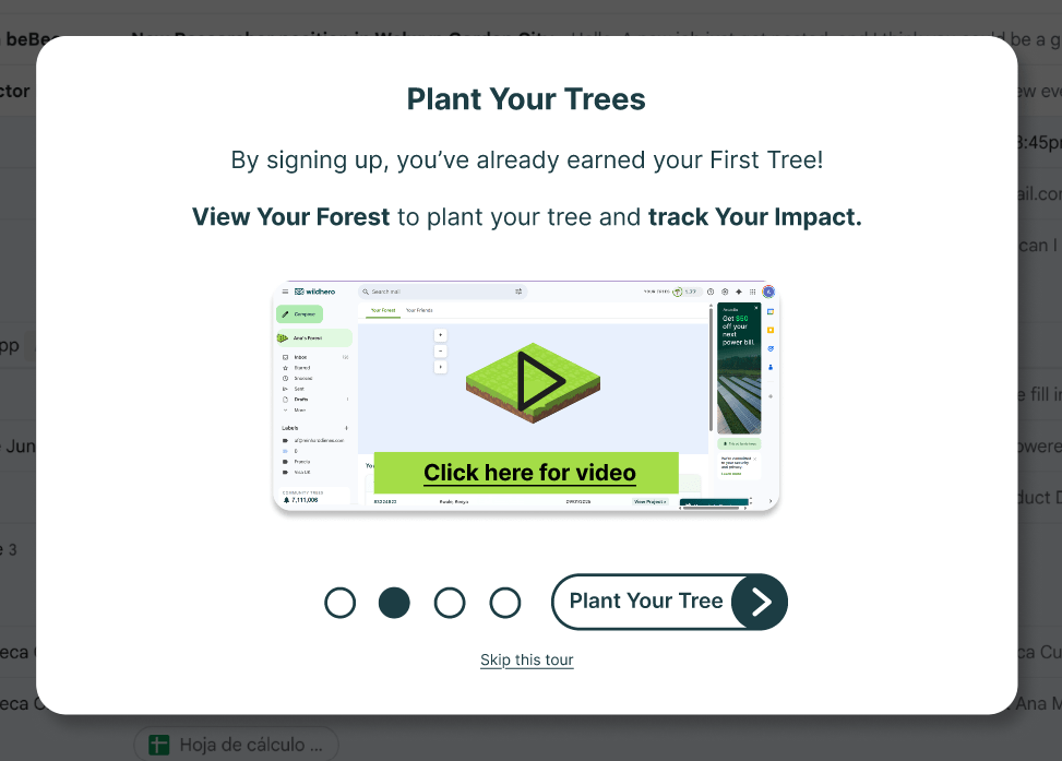
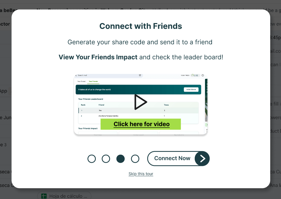
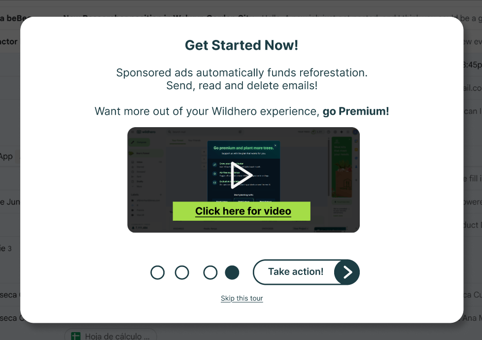
The New Onboarding Flow
To address the “user’s comprehension” and “trust deficit,” we created a concise, function-oriented 4-step onboarding flow. It focuses on quickly answering the user’s main doubts, inducing users to explore the interface for the first time which will increase the rate of retention.
How this works? is my data safe?
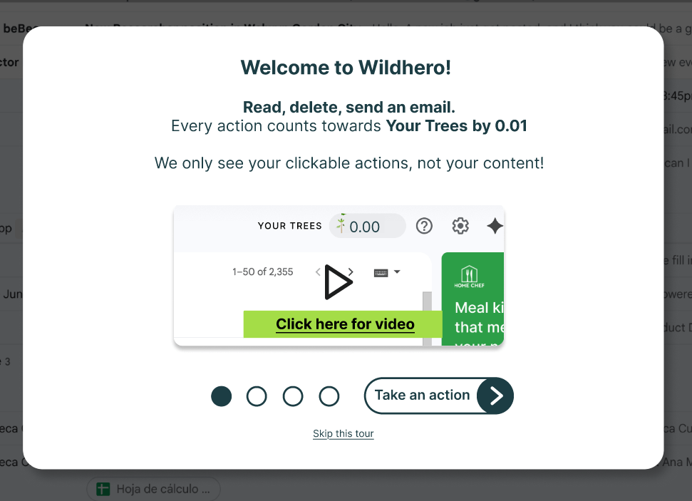
How to plant trees?
How to play with friends?
Who pays for the real trees?
Deliver
A second round of usability tests and follow-up interviews were executed using the Figma prototype with 4 new participants, the research study kept the same test structure and protocol.
Positive findings
- Most users felt confident and aware about the functionality of Wildhero.
- The process of adding friends was clear for all the participants after the videos.
Opportunities to improve
- The textual information was missed by some participants, due to short attention span or the attention being on the videos. Timing the text so it appears inside the video as it plays, could be a more dynamic way to present the information.
- Users knew that deleting emails will count towards their points, so they would try to delete a bunch of emails at the same time to make the counter rise, but they would feel frustrated when the number wasn’t as high as expected. The cap on the amount of tree parts a user can earn per day should be shared.
Reflections & Next steps
This project highlighted the critical importance of a strong first impression. While the UI redesign solved immediate usability issues, the strategic shift in the onboarding narrative was the true driver of retention. Future studies could include A/B testing different onboarding flows with high fidelity prototypes, as well as diary studies to measure longer term of usage and motivation.
